Suffolk Shed
A logo and brand for metal house signs, designed and made in Suffolk.
- Client
- Suffolk Shed: metal house signs, made to order
- Where
- Bury St Edmunds, Suffolk
- What we did
- The logo and its versions, the colours, simple brand guidelines and printed flyers, then ongoing technical advice
- When
- 2024, with advice since
The brief
Suffolk Shed makes metal house signs to order: names and numbers cut from steel, in a wide range of designs, sizes, finishes and fixings. It was a new business, and it needed to look like a proper maker from the very first sign.
The logo had to work everywhere a small business turns up: a tiny circle on Instagram, a flyer in a shop window, a sticker on a parcel, the side of a van. And it had to feel made by hand, because the signs are.
The look we aimed for: workshop tools, drawn by hand but with clear lines. The life of a sketch, with the precision of clean vector shapes, so it stays crisp and readable even at small sizes.
The idea
A shed, drawn by hand, with the tools of the trade inside: a paintbrush, a pencil, a ruler and a set square. Designing and making, in one simple mark. The outline has the energy of a quick sketch, so it feels made by a person, not a factory. But every line is a clean, even vector shape, so nothing gets lost when it’s shrunk to a social media icon.
Next to it, the name in a heavy, plain capital that reads from across a craft fair. Filling the shed with yellow gives a second version that stands out on white, and the shed on its own becomes the icon for small spaces.

One logo, every background
A logo is only as good as its worst outing. So it comes in versions for light and dark backgrounds, for full colour and for one-colour printing, each one ready to use.
-
Main logo. On white or light backgrounds. The first choice wherever it fits.
-
Damson on yellow. For bold pieces: flyers, stickers, the van.
-

White on damson. The white-out version, for dark backgrounds.
-
Yellow on damson. One colour on dark, as on the flyers.
-
Charcoal. One-colour printing, invoices and engraving.
-
Charcoal with highlight. Two-colour printing in charcoal and yellow.
-
Icon, yellow
-
Icon, damson
-
As a website icon
Colour
Two colours do the work: a deep damson and a bright shed yellow. Together they’re hard to miss, and they suit a traditional, hand-made product without looking old-fashioned. Around them sits a small supporting set, taken from the signs themselves and the brick they’re photographed on.
-
Damson
#64000A · RGB 100, 0, 10
The main brand colour: the logo, headings, buttons and big panels.
-
Shed yellow
#F1ED00 · RGB 241, 237, 0
The highlight: the shed, backgrounds that need to stand out. Never for text on white.
-
Charcoal
#212427 · RGB 33, 36, 39
Body text, and the one-colour logo.
-
Steel
#9AA1A6 · RGB 154, 161, 166
From the signs themselves: lines, borders and quiet details.
-
Brick
#A65A3A · RGB 166, 90, 58
From the brick the signs are photographed on. Sparingly.
-
Paper
#FAF7EF · RGB 250, 247, 239
A warm off-white for pages and panels.
Colours that are easy to read
Every pairing below was checked against the accessibility standard for text (a contrast of at least 4.5 to 1), so the brand stays readable for people with poorer eyesight, and on a phone in bright sunlight. The one pairing that fails is yellow on white (1.2 to 1), so yellow is never used for text on a light background.
- Suffolk Shed
Damson on yellow: 10.9 to 1
- Suffolk Shed
Damson on white: 13.6 to 1
- Suffolk Shed
Yellow on damson: 10.9 to 1
- Suffolk Shed
Charcoal on yellow: 12.5 to 1
- Suffolk Shed
White on brick: 5.1 to 1
Simple rules, so it always looks right
Whoever makes the next flyer, sticker or social post, a few plain rules keep the brand consistent.
Give it room
Keep clear space around the logo at least the height of the word “SHED”. Nothing else goes in that space.
Not too small
The full logo no smaller than 30mm wide in print, or 120 pixels on screen. Smaller than that, use the shed icon on its own.
Pick the right version
Damson or charcoal on light backgrounds; white or yellow on damson. Never yellow on white.
Not on busy photos
Put the logo on a solid panel of colour, as on the flyers, never straight onto a photo of brick or steel.
Don’t redraw it
No stretching, squashing, outlines, shadows or new colours. Always start from the files supplied.
Words: classic and plain
Headlines in a bold, traditional serif, like the lettering on a good house sign. Details in plain, easy-to-read text.
In use
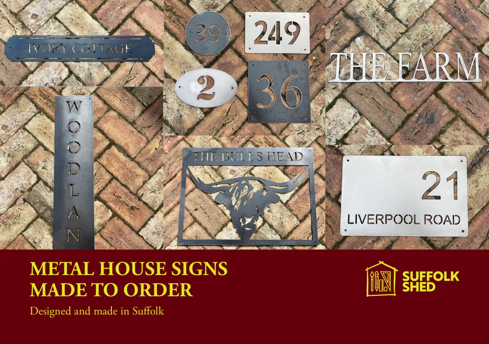
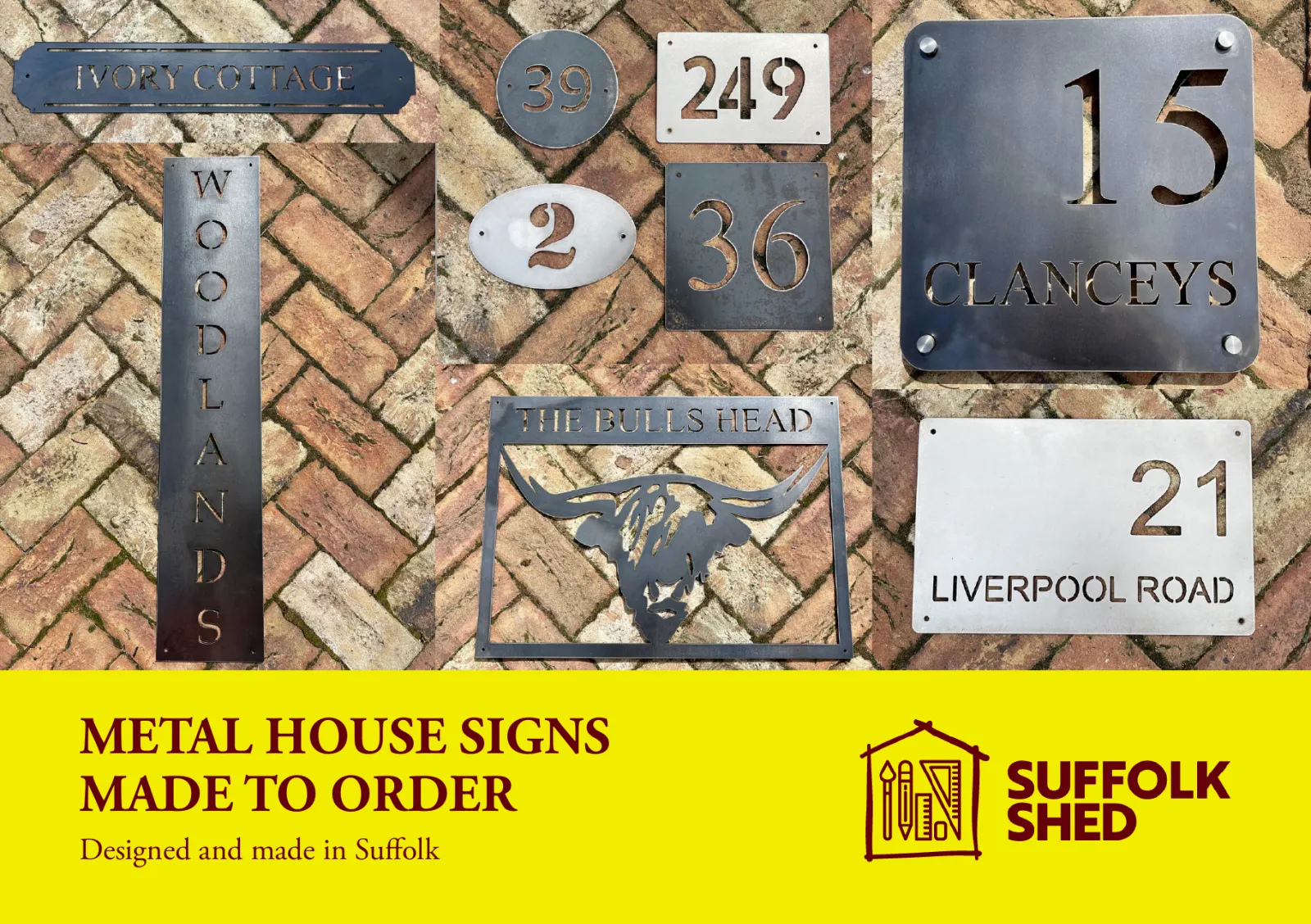
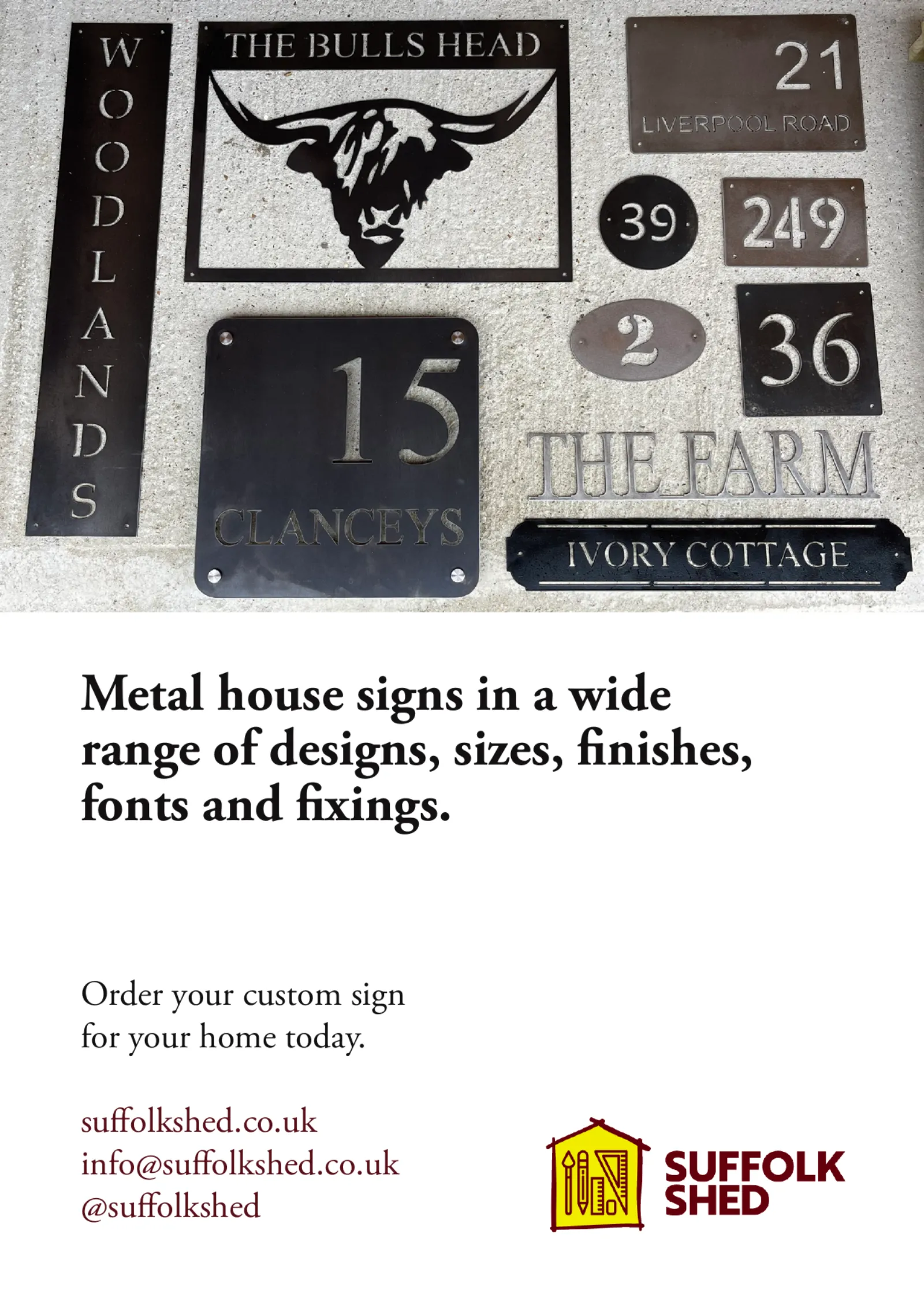
A5 flyers for local shops and events: the signs first, on the brick they’re made for, then the logo on a solid band of damson or yellow.
Ongoing technical advice
Since the brand launched, we’ve been Suffolk Shed’s go-to for the technical side of running the business. Rather than working it out alone, they ask, and we help them make the right call.
- Their Shopify shop: advice on setting it up and running it, from settings to getting the most from it.
- Getting found on Google: what to change, and what’s worth the time.
- The tech behind the business: choosing and setting up the tools they use day to day.
- Business decisions with a technical side: a straight answer on whether something’s worth doing.
Need a logo that works everywhere?
From your Instagram picture to the side of your van: a logo with every version you need, and simple rules for using it.
Logo package